Post by Jason Mckerra on Aug 4, 2009 20:46:00 GMT 10
Well, after some discussion in the micro economys thread, I've decided to look into some cheaper ways of making a convincing (ish) looking passport.
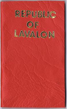
The Design
For a cover I've settled on a think faux red leather table cloth.
My idea is this, using a hot glue gun, stick a decent piece of scrap booking card to the back of the lino, cut out the shape of the covers, fold, stitch pages in.
For pages, more half decent craft paper (to get that watermark look).
For the passport details on the interior flap, I am trying to find a clear hologramatic sticker of appropriate size. Print the details (photo etc) onto the interior lining card card (before gluing!), then once the backing card is glued to the lino, cover the interior with the hologram.
I think all of this should work. What I'm stuck on is the gold lettering on the cover.
Does anyone have any ideas how I could get embossed gold lettering onto red lino? Preferably using some kind of printing method, because I don't have the steady hand required to just draw it with a gold paint pen!
Sourcing the Materials
With the exception of gold lettering all the materials have proved rather easy. Spotlight, a cloth/wool/craft shop had the faux red leather table cloth material, and plenty of decent water mark looking paper.
An office supplies shop had some clear address label stickers, which I think should work for covering the printed details on the backing card.
Putting it together...
I'm going to have a shot at putting something together on the weekend, I'll post photos so you can see the outcome.
Any other ideas on materials or methods, especially a way to do the gold lettering, would be greatly appreciated!